
NEWS
- A new phylin version is available at CRAN. Please update your packages!
- The source code was migrated to github.com .
- The new version allows to construct a variogram using multiple trees from the posterior probability distribution.
- The tutorial is included as a vignette in the package. You can access using vignette("phylin_tutorial").
Installation
You need the R programming environment. If you don’t have it installed, please go tho their homepage, download and install a version compatible with your operating system.
The phylin package is available trough CRAN. To install and load the package at the R console, type the following commands:
If you are using a graphical environment for R, look for package installation in the user manual. Additionally you might wan tto install additional packages that might be useful:
- geometry – Useful to calculate Delaunay triangulation for some functions.
- sp or rgdal – To open raster/grids to define interpolation areas.
- ape – To open and manipulate phylogenetic trees
Although these packages (or equivalent) will offer a great advantage to read and manipulate phylogenetic and spatial information, we do not cover their use in this tutorial as phylin does not depend directly on any of them. Please refer to each package tutorial for additional help.
Example data
Phylin includes an comprehensive example using real data from Vipera latastei in the Iberian Peninsula. Please refer to the original data publication (Velo-Antón et al., 2012) for details. The examples data sets include:
- d.gen – A matrix of genetic distances calculated using the original phylogenetic tree.
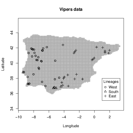
- vipers – A table containing the spatial coordinates and lineage classification for each of the 58 samples available.
- grid – A table containing grid centroids defining the interpolation area (7955 cells).
The data can be attached to your R session using data command:
> data(vipers)
> data(grid)
Additionally you can plot the data using example command:
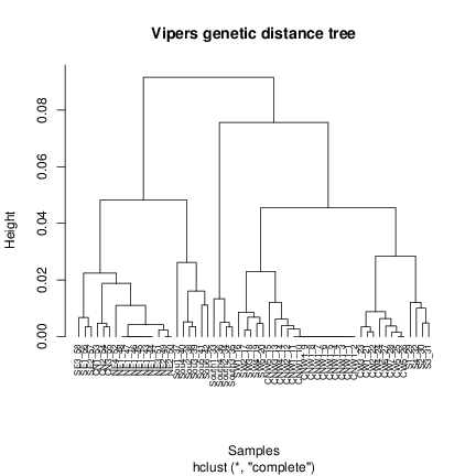
Every function/data in phylin has an example attached that you can check using this command. The example of the genetic distance matrix will plot a tree based on the hierarchical clustering with the matrix data. It is advisable here to use an specific package to deal with the phylogenetic trees (e.g. ape) to maintain the height scale and to easily manipulate the tree. Phylin was built to not depend in additional packages directly, so we use the hclust function from R base to build the tree:
> plot(hc, hang = -1)
This code1 is used in the example to generate the tree.
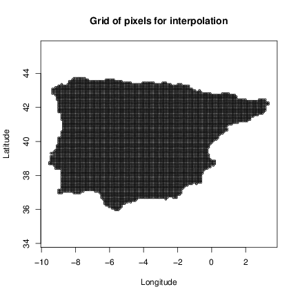
The examples of the grid data set will show the interpolation area and the vipers data set will show the samples locations and lineage classification. Note that for demonstration purposes we have opted for a interpolation area covering the full Iberian Peninsula. However, you will probably want to interpolate over a specific area covering the distribution of your species and not extrapolate to outside that area. This can be done using a grid with the centroids covering the area of interest. You can build this grid in any GIS software and then import to R using a package to read spatial data (e.g. rgdal) or build directly in R using a spatial package or native R functions (e.g. you can create a lit of centroids using expand.grid command and then filter those of interest).
Now we have in our session all data needed to build the genetic surfaces (lineages occurrence maps and potential contact zones). We will start by build the variograms and fit models using the genetic distance matrix and sample locations. Then we proceed with the spatial interpolations for our grid.
Variogram
The variogram (commonly shortened from semi-variogram) is a way to describe the spatial dependence of the data by plotting semi-variance against distance. By spatial dependence it is understood the statistical dependence of the samples based on their locations. The variogram will also indicate the distance from where the samples may be considered independent, i.e., where there is no spatial autocorrelation. Building a variogram is easy in phylin. We will use the function gen.variogram with matrices of real distances and genetic distances. To generate the matrix of real distance we will be using the dist function from R base functions:
We just need the coordinates2 for each sample to build this matrix (columns 1 and 2). Note: you should be sure that the sample order in rows and columns of both matrices correspond. The variogram is built with the following command:
Additional arguments to gen.variogram define the lag size and maximum distances to analyze. Each pair of points will be classified in the same lag if their distance is within the lag +/- lag tolerance. This is very important so we can have multiple points to define the semi-variance for each lag. Samples with long distances are usually less frequent, and the number of points available for higher lags may be very small. The maximum lag is used in these cases to define the maximum distance to calculate lags in order to avoid misleadings from small n.
This function provides a small change of the usual kriging method. Instead of using sample locations with a continuous value for each sample to interpolate (e.g. altitude value) and calculate the pairwise differences, we use the genetic distance matrix as the pairwise difference due to the lack of continuous value at each sample point. This allows to avoid the use of midpoints between samples to project the genetic distance in space.
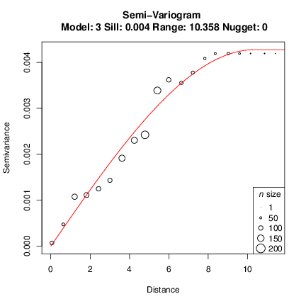
We can now plot the variogram and check the structure.
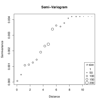
The resulting plot shows the spatial structure of our data by means of the semi-variance. The circle size is relative to the n size for each lag. The long distance lags have smaller n however the n > 13 for all lags here. You can check n for each lag and other proprieties by inspecting the gv object created above:
[20] 13
The resulting vector is the n for each lag created. You should also check the summary of the variogram:
Number of samples: 58
Variogram parameters
lag: 0.602
lag tolerance: 0.301
maximum distance: 11.739
lags with data: 20
semi-variance summary:
Min. 1st Qu. Median Mean 3rd Qu. Max.
6.884e-05 1.386e-03 3.471e-03 2.782e-03 4.193e-03 4.193e-03
No model found.
Now it is time to fit a model to the variogram. Common models fitted to a variogram are the spherical, gaussian, exponential and linear. With phylin we can use the function gv.model to fit a model to the previously built variogram. We will try with the defaults first (spherical model) and it will estimate the best model by non-linear least square estimation:
The model is quite good for this data. However, fitting a model to a variogram may be a cumbersome task, and visual inspection after trying modifying the model parameters might yield a model better describing the spatial structure. We will tweak the parameters and manually define a range value and then check a linear model as an example:
> gv.linear <- gv.model(gv, model='linear', range=8)
> layout(matrix(1:2, 1, 2))
> plot(gv2)
> plot(gv.linear)
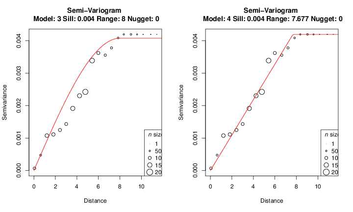
You should try other models to change the remaining parameters (sill and nugget) to get a good fit. We will continue with the first built model and attributed to gv object. After fitting a model you can check the summary table:
Number of samples: 58
Variogram parameters
lag: 0.602
lag tolerance: 0.301
maximum distance: 11.739
lags with data: 20
semi-variance summary:
Min. 1st Qu. Median Mean 3rd Qu. Max.
6.884e-05 1.386e-03 3.471e-03 2.782e-03 4.193e-03 4.193e-03
Semivariogram with spherical model (R squared = 0.9801)
Model parameters:
sill: 0.004
range: 10.358
nugget: 0
The R2 can be a good hint while fitting a model. However, non-linear least squares will give an optimal R2 for a model but you may still want to change the parameters and model type.
The variogram will return several parameters no analyze biological patterns. For instance, an isolation-by-distance pattern implies that the semi-variance stabilizes at a certain value (sill parameter) after a distance given by the range parameter, defining an area where the genetic similarity based on the genetic distances decreases rapidly. This assumes a stationarity of the process, meaning that the mean and variance are stable and only the geographical distance will affect the autocorrelation structure (for more details see Wagner et al., 2005 including biological processes that may affect stationarity assumptions).
Spatial interpolation of lineage occurrence
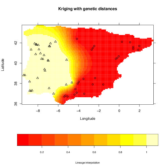
The spatial interpolation in phylin is achieved by kriging. This method uses the model in the variogram to include a description of the spatial dependence of the data to predict values to other locations where we don’t have samples available, instead of relying only in the distance between sample and locations to interpolate (e.g. inverse distance weighting). The application of this interpolation method is usually done with continuous data at the sample locations. However, since we used the genetic distance matrix, we only have pairwise values and not a value for each sample. To circumvent this problem we use the tree to classify the samples to either 1 or 0, which means that the sample belongs or not, respectively, to a particular cluster/lineage. Because in our data we have three lineages, we will build three maps depicting the potential area of occurrence of each lineage. The vipers data has already defined the lineage classification and we extract the binary classification for the first lineage and apply the krig function:
> int.krig <- krig(lin, vipers[,1:2], grid, gv, clamp = TRUE)
For the krig function we have used the lineage classification, the sample coordinates in column 1 and 2 from vipers table, the grid table defining the area to interpolate and or variogram gv with the model built. The clamp argument, when set to TRUE, sets all negative values and values higher than one to zero and one, respectively. The object built, int.krig has two columns: one with the predicted values (Z) and the other with standard deviation of the interpolation (sd).
Phylin has also plotting functions to ease the plotting of interpolation surfaces. With some experience with R plotting functions, you might want to use the information directly that you can assess in the int.krig1 in conjunction with the grid centroids.
+ xlab='Longitude', ylab='Latitude',
+ sclab='Lineage interpolation')
> points(vipers[,1:2], pch=lin+1)
We can also see the standard deviation of the interpolation by defining the optional argument ic:
+ xlab='Longitude', ylab='Latitude',
+ sclab='Standard Deviation')
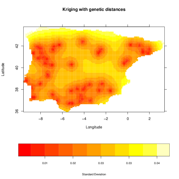
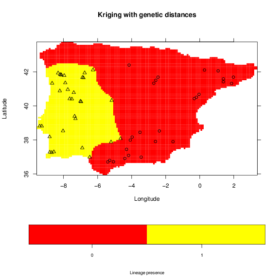
The standard deviation increases between sampled locations, thus, correlating with the distance to samples. A map that may be useful is the binary occurrence of a lineage. For this purpose we will use a threshold of 0.95, which will classify the area of probability higher that this value as one.
> grid.image(lin.krig, grid, main='Kriging with genetic distances',
+ xlab='Longitude', ylab='Latitude',
+ sclab='Lineage presence')
> points(vipers[,1:2], pch=lin+1)
Potential contact zones
To derive a map of potential contact zones we have to sample the phylogenetic tree at different lengths. We will use three different sampling schemes here: 1) sampling with a constant length, 2) sampling at each node position and 3) a single threshold. We will create two vectors holding the lenghts/thresholds for tree sampling for our hc tree:
> regSampling <- seq(0.01, 0.08, 0.005)
> #node sampling (avoiding the tips)
> nodeSampling <- hc$height[hc$height > 0.01 & hc$height < max(hc$height)]
> #single threshold
> singleSampling <- 0.06
> length(regSampling)
The lowest tree length value used here is 0.01 for both first and second sampling schemes. This avoids computation of maps between samples or very recent splits. We can check the position of the sampling in the tree. We are using the R base functions for plotting the tree and thresholds but you could use other package that manipulates phylogenetic trees.
> plot(hc, hang = -1, labels = FALSE, main= 'Regular sampling')
> abline (h=regSampling, col='red', lty=2)
> plot(hc, hang = -1, labels = FALSE, main='Node sampling')
> abline (h=nodeSampling, col='red', lty=2)
> plot(hc, hang = -1, labels = FALSE, main='Single threshold')
> abline (h=singleSampling, col='red', lty=2)
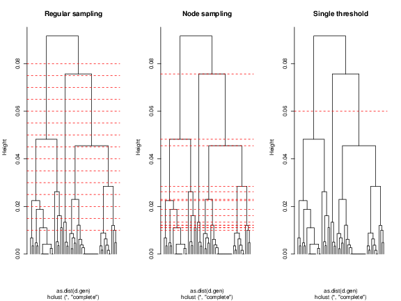
The red lines indicate the chosen thresholds. As expected, the node sampling represents each split, giving few importance to the brancgh structure. On the other hand, regular sampling of the tree will provide more information on the structure, i.e., the most divergent splits showing a structure of fewer clusters are sampled more times. This will inflate the probabilities at older contact zones, whereas the first will be more uniform. The single threshold used is dividing the three major lineages found. This gives the user the flexibility to use either these suggested schemes or any other, as long as it is possible a binary classification of the samples.
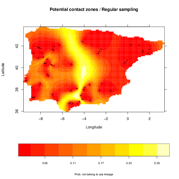
To build the maps of potential contact zones we have to build maps of lineages/clusters for each tree threshold. The lineages maps in each threshold are then convert to the complement (the probability of not belonging to the lineage or belonging to all other lineages) and multiplied. These process allows to eliminate the presence of each lineage successively, resulting in a map of potential contact zones for the threshold. The resulting maps from all thresholds are averaged to generate a final map of the potential contact zones. The following code is for the regular sampling:
> for (h in regSampling) {
+ lins <- cutree(hc, h=h)
+ print(paste("height =", h, ":", max(lins), "lineages")) #keep track
+ ct = rep(1, nrow(grid)) # Product of individual cluster/lineage map
+ for (i in unique(lins)) {
+ lin <- as.integer(lins == i)
+ krg <- krig(lin, vipers[,1:2], grid, gv, clamp = TRUE, verbose=FALSE)
+
+ # Product of the complement of the cluster ocurrence probability.
+ ct <- ct * (1 - krg$Z)
+ }
+ contact = contact + ct
+ }
> # Recycle krg with averaged potential contact zones
> krg$Z <- contact / length(regSampling)
This code may take a while to run. For the node sampling, replace the regSampling with nodeSampling in the previous code. For single threshold you should replace with singleSampling. The krg object holds the information of potential contact zones. We can use grid.image again to see the map.
+ xlab='Longitude', ylab='Latitude',
+ sclab='Prob. of multiple lineage occurrence')
> points(vipers[,1:2], cex=0.5)
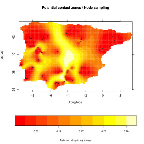
a similar map for node sampling:
and a simple map for the single threshold.
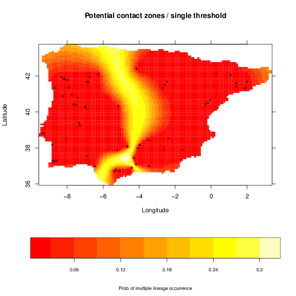
As expected the pattern of the maps is very similar. Nevertheless, the division of older and more divergent lineages is shown more clearly with the regular sampling, with higher probabilities. This map is, thus, related to the genetic divergence, with higher probability indicating potential higher divergence. However, the width of the potential contact zones may change with extra sampling to better define this area.
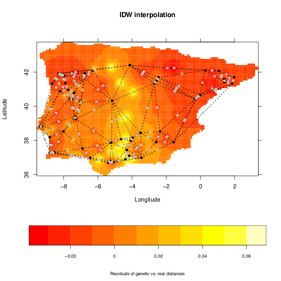
6 Other methods in phylin
Phylin has functions to build maps based on midpoints and inverse distance weighting (e.g. ??). To represent the pairwise data of the genetic distance matrix we generate midpoints between neighbors. To correctly generate these midpoints we need the geometry package installed. It offers methods for Delauney triangulation that are used by phylin if the package is available. To generate the interpolation of the residuals from a linear regression we attribute the residuals to the respective midpoints:
> d.real <- as.matrix(r.dist) #real distances to matrix
> fit <- lm(as.vector(d.gen) ~ as.vector(d.real))
> resid <- matrix(fit$residuals, nrow(vipers), nrow(vipers))
> dimnames(resid) <- dimnames(d.gen)
> mp$z <- extract.val(resid, mp[,1:2])
> int <- idw(mp[,5], mp[,3:4], grid)
Note: we are using Ordinary Linear Regression availabe with R base installation instead of the Reduced Major Axis Regression as suggested by ?. We can use grid.image to see the results and add the triangulation and midpoints:
+ xlab='Longitude', ylab='Latitude',
+ sclab="Residuals of genetic vs. real distances")
> # plot samples connecting lines
> for (i in 1:nrow(mp)) {
+ pair <- as.character(unlist(mp[i,1:2]))
+ x <- c(vipers[pair[1],1], vipers[pair[2],1])
+ y <- c(vipers[pair[1],2], vipers[pair[2],2])
+ lines(x, y, lty=2)
+ }
> points(vipers[,1:2], pch=16) # plot samples points in black
> points(mp[,3:4], pch=16, col='gray') # plot midpoints in gray
References
Miller, M. P., Bellinger, M. R., Forsman, E. D., and Haig, S. M. (2006). Effects of historical climate change, habitat connectivity, and vicariance on genetic structure and diversity across the range of the red tree vole (Phenacomys longicaudus) in the Pacific Northwestern United States. Molecular Ecology, 15:145–59.
Vandergast, A. G., Bohonak, A. J., Hathaway, S. A., Boys, J., and Fisher, R. N. (2008). Are hotspots of evolutionary potential adequately protected in southern California? Biological Conservation, 141:1648–1664.
Velo-Antón, G., Godinho, R., Harris, D. J., Santos, X., Martínez-Freiria, F., Fahd, S., Larbes, S., Pleguezuelos, J. M., and Brito, J. C. (2012). Deep evolutionary lineages in a Western Mediterranean snake (Vipera latastei/monticola group) and high genetic structuring in Southern Iberian populations. Molecular Phylogenetics and Evolution, 65:965–73.
Wagner,
H. H., Holderegger, R., Werth, S., Gugerli, F.,
Hoebee, S. E., and Scheidegger, C. (2005).
Variogram analysis of the spatial genetic structure of
continuous populations using multilocus microsatellite
data. Genetics,
169:1739–52.
Credits
Phylin is available at CRAN and released under GNU GENERAL PUBLIC LICENSE. See www.gnu.org/licenses for details.Contact:
ptarroso at cibio.up.pt
Phylin was published in Molecular Ecology Resources.
Please cite:
Tarroso, P., Vélo-Antón, G., Carvalho, S. B. and Brito, J. C. 2014. Phylin - An R package for phylogenetic interpolation. Molecular Ecology Resources, in press.
(last updated: Oct-2015)